Quadrant Travel Marketplace
I designed a B2B platform from scratch that lets travel agencies upload, structure and distribute their own product. A project I started as a UX designer and where I progressively took on Product Owner responsibilities.
My role
UX designer on the project: research, flows, prototypes, coordination with development and QA. Over time I took on the product decisions — prioritization, backlog, stakeholder alignment — until that role was formalized.
The best part of this evolution was having been on both sides from the start: understanding the user's needs and negotiating what to build and in what order.
The problem
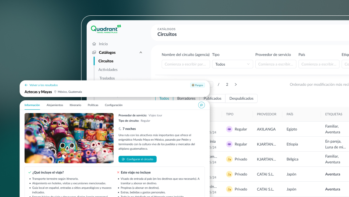
Agencies with their own product couldn't operate as wholesalers
Quadrant Travel Cloud let them sell third-party product. But agencies with their own tours and services had no way to upload, structure and distribute them. The challenge wasn't designing a form — it was understanding a complex business flow (content, contracts, rates, bookings) and making it simple and fast for product managers.
Key decision 1
Split content, contracts and rates into independent layers
After the research we understood that creating content and loading rates are different tasks, handled by different user profiles. Content rarely changes; rates change every season. Splitting them into layers lets you update prices without touching the content and assign permissions by role.

Key decision 2
Start with tours only, to deliver value sooner
The tool was meant for multiple service types. We decided to start only with tours, because that's where agencies had the largest volume of product and where the impact would be immediate.
Product phasing strategy
Tours
- Catalog and content loading
- Contracts and rates
- Booking management
- Distribution to retailers
More service types
- Activities and transfers
- Experiences
- Other travel products
Supplier access
- Suppliers upload their own product
- Open marketplace model
Deciding what not to build is as important as deciding what to. The criterion was clear: real usage volume, not pending complexity.
Key decision 3
Progressive step-by-step onboarding, not a single form
The first prototype was a long form on a single screen. In the user sessions we spotted a pattern: managers don't have all the data available at the same time. We redesigned the flow into 4 steps, working out which fields would be required and which optional to create an entry.
Results
A product in production
Multiple modules validated with users and in production.
A cross-functional way of working consolidated across design, PO and development.
A 3-layer structure that scales without restructuring what's already built.
From UX Designer to Product Owner: a transition toward a more strategic position.

Reflection
What I'd do differently
I'd start documenting prioritization decisions explicitly sooner. Many were made in informal conversations and went unrecorded — which created context debt at different points in the project. I'd also set up usage metrics earlier: qualitative feedback is solid, but without quantitative data it's sometimes hard to justify certain prioritization calls.